HARTFORD, Conn. – Permatex, a leading innovator in chemical technology for automotive maintenance and repair, has just developed and launched a new logo for its Permatex brand. The new design will be used as both a graphic for its corporate identity as well as a logo mark for its product packaging and marketing communications. 
The announcement was made by Sean Lyon, director of marketing and product management for Permatex, who noted, “Our primary objective in developing a new logo was to create a clean, modern and uniform look for the Permatex brand. We had been using the familiar blue and orange box design on all of our packaging since 1970, and in early 2000, we introduced a separate Permatex corporate logo for internal use and marketing. Over the years, we felt that the use of two logos did not work to our advantage in maintaining a strong Permatex brand mark and contributed to some confusion among consumers.”
According to the company, the new logo update continues to use the same well-known corporate colors of blue and orange, the ubiquitous Permatex swirl and a font that is somewhat similar but a refresh to the current typography. Lyon further explains, “The end results of our efforts is a crisper and cleaner, more modern appearance, which we believe will create a stronger symbol to which all of our consumers can relate. The new logo is the first element of a new package design that Permatex plans to launch in 2014. It is our hope that this ‘new face’ of Permatex will allow consumers to more easily shop all of our product categories.”
In addition to product packaging, the new logo is being incorporated into all marketing materials, including website, social media, cataloging and other forms of communication.

PHINIA Reports Q1 2024 Results
U.S. GAAP net sales were $863 million, an increase of 3.4% compared with Q1 2023, according to PHINIA.

PHINIA Inc. reported results for the first quarter ended March 31, 2024.
First Quarter Highlights:
U.S. GAAP net sales of $863 million, an increase of 3.4% compared with Q1 2023.
Excluding $17 million of contract manufacturing sales, sales were up slightly compared to Q1 2023. Favorable pricing and currency were partially offset by lower commercial vehicle sales in Europe.
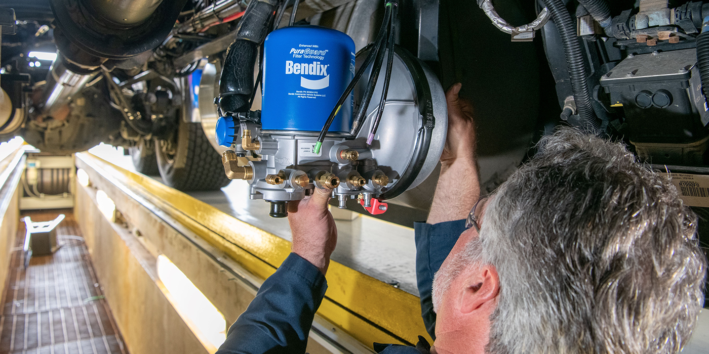
Bendix Making Changes at Indiana Manufacturing Operation
Bendix said it is transforming its distribution center into a state-of-the-art facility and consolidating dampers manufacturing into a single, larger space.
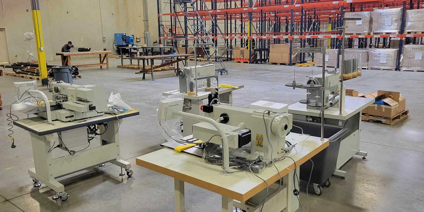
Doleco Announces Facility Expansion in Charlotte
The 33,000-square-foot facility is strategically positioned near major transportation hubs, providing optimal access to raw materials and speeding shipment of finished goods to all U.S. markets.
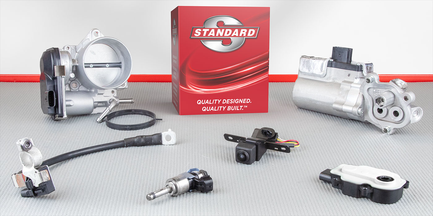
Standard Motor Products Introduces 268 New Numbers
The release provides new coverage in 75 product categories and 80 part numbers for 2023 and 2024 model-year vehicles, SMP said.
MAHLE Releases 2023 Sustainability Report
MAHLE noted it made significant progress in reducing its CO2 emissions, and increasing the use of renewable electricity.

Other Posts
Transtar Industries Continues Rapid Product Line Expansion
The company is now offering OE recycled engines, in addition to its expansive line of OE recycled transmissions and transfer cases.
ZF Cleans Up Metro Park for Earth Day
ZF said the effort was in line with its dedication to sustainability, zero-waste and circularity.

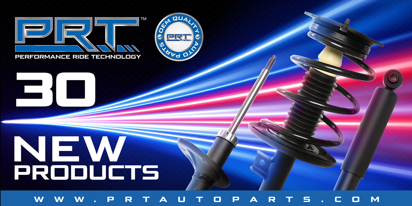
PRT Launches 30 New Complete Strut Assemblies
The new items represent more than 10 million vehicles in new coverage, PRT said.
Motorcar Parts of America’s Selwyn Joffe on Core Values
Sustainability is embedded in every facet of the company’s operations, Joffe affirmed.